
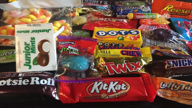
Let’s face it, when we were young, you probably enjoyed candy such as Tootsie pops, Reeses, and even a Snickers bar. But, did you know that it was never about the candy, but the packaging. But, let’s talk about the different ways you can pack candies and the amazing designs associated with this.
First, is Karamellieriet, which is a packaging that’s inspired by curves that are visible during the process of making caramels, ad they showcase elegant candy expression.
Then there is Amado, which was done by a Mexican artisan bakery and technique, making it a fine art and creating both tradition, and modernism that makes the product stand out.
Bardot is another, and while it’s not technically candy, it actually looks like a treat. The designer worked with packaging ice cream brands and learned that this simple little mark that started off as a quick little sketch created a solution that’s crafted well, is flexible, and it does create an interesting system.
If you’ve ever had Awake Chocolate, you may notice you like it initially because well, towels, but did you know that it might also be because of the gender-neutral packaging?
Hopeatoffie uses lines, and this iconic licorice actually has a design that affected sales in a significant manner by the slight design change, showing that yes, a little bit of a chance can affect a product.
Then there is the Grown Up Chocolate Company, which is a designer with the idea that the product reminds you of a pleasant experience, one that you probably haven’t had since you were well, a child.
Sweeteeth is another hand-crafted chocolate company, and the inspiration for the packaging on this is from children’s books. Speaking of animals, Koala-La is another great one. It’s a cotton candy that’s in Indonesia, and while it is a school project, the use of animals, especially cute little koalas, plays a huge part of this.
Zuba Rocks are another one with an interesting design, since it is inspired by fantasy landscapes, and fruits that take the isometric form. The goal of this is to create a fantasy with good visual language, according to the owner of the website.
Theo chocolate is another great one with amazing packaging. While it is a very old bar in terms of how long it’s been around, it actually has a beautiful packaging, and it does create a beautiful design that looks amazing and uses good color schemes.
Zang, another chocolate packaging, uses vibrant colors and it is new, but it is a wonderful look to a favorited snack: dark chocolate.
Leleka Chocolate is an example of minimalism being used to design. While it is a fictional chocolate brand, the minimalistic design is something that you will gravitate towards regardless, since well it is different from many of the other different chocolate brands that are out there.
Finally, let’s talk about Lugard, which has gorgeous packaging, and this sugar-free ginger candy not only tastes good, but you’ll see that the packaging uses creative colorings and the like on it, attracting customers to this. It might seem like it’s very in your face and different, but that’s probably why it gets all of this attention since usually, most candy companies don’t take that kind of risk with it.
As you can see from all of these examples, they range from tried and true design that looks pretty simple to elaborative designs that are definitely bigger than anything that you’ve seen. When it comes to choosing a packaging for chocolate, you’re given a lot of options, whether it be minimalistic, or something that’s loud and fun. If you’re having trouble figuring out why your candy may not be as popular, the first thing you should always check is the packaging. Remember, before the person even thinks about putting the candy in their mouth, they’ll see your package, and a beautiful packaging does make a huge difference in the actual result of sales, conversions, and people taking the time to enjoy your candy.